Books and Cleverness

A layout using Magical Memories designed by Alicia Redshaw.
Hi there it is Kathy from Kathyloves2scrap with a layout created for Scrapbook Fantasies using the amazing paper range – Magical Moments designed by Alicia Redshaw.

This fun, magical layout used the Magical Memories #1, #3 and #5 pages to build a multidimensional layout. Using both sides A and B of the papers, fussy cutting the printed elements and using the colour cut ots outs, three photos were showcased and the products complimented the theme of these.

By cutting the large book from Magical Memories #1, the half and half design was started.

From there I was able to carefully and strategically layer up my photos while building the background further with fussy cut books from Magical Memories #5. 


Using the stencil – Blotchy Spots, I added some masking to three of the books to add an aged effect to the pages and provide interest for the eye to roam the page.


I then added fussy cut elements from Magical Memories #5 – the B side and colour cut outs to build clusters around the page. I include the frog, the owl and the bee, all symbols that added to the theme of the page and used the remainder of the green from Magical Memories #1 to cut leaves to bulk up the clusters.


I finished off the page with some cut banners and tags to replicate book marks and text highlighters and cut the title from Magical Memories #1.


The layout came together beautifully to showcase an afternoon spent in a magical world and constructed from magical papers.


Full audtition video can be found on my YouTube Channel here:


Airlie Beach layout

 Airlee Beach

Hi there today I am sharing a layout I made for the Series 14 30 Days of Sketches on Facebook.


I used day 1 sketch - designed by Ginger from Ginger’s corner.


I love this and how it turned out.


Lots of die cuts and layering turning this cute layout into something special to remember my recent cruise away with my youngest.

Full process video can be found on my You Tube channel.


Thanks for looking.

Happy scrapping until next time
💛Kathy

Green with Envy - Ginger’s Corner swap

 Green With Envy

Something a little different today. I made these embellishments for the main swap on Ginger’s Corner on Facebook.

The theme was Green with Envy …. And anything could go as long as it was green.

I had to make 10 for the swap and it needed to be flat.


So of course I had to choose a St Patrick’s Day theme. I started by folding 10 origami envelopes out of 5 x 5 paper.
I slipped in a 3 leaf clover and topped off with some die cuts and tickets. So cute!

These will all be sent and swapped out for 10 different ones. I forget how much fun miniature art is and love getting creative this way.


Thanks for looking.
Happy Scrapping 
💛Kathy

Seriously Amazing


 30 Days of Scrapping Series 13 Day 7 Sketch


Hi there today I am paying homage to the sketch created by Cheryl Ashcraft. 

This was a great sketch to work with. Of course my photos are larger but that is the beauty of sketches, you just need to be open to the idea and run with it.
Using the Bee Arty Sugar Glider paper, this came together perfectly for these wedding photos of my daughter and her husband.

Tucking the circle halves in behind the fussy cut prints from the page made this an easy to build multi dimensional page. 

Fussy cutting elements from the Bee Arty paper range Aussie Bushland, I was able to layer up the layout and provide interest to compliment the photos.
I was pretty pleased with the final results.
Thanks for taking the time to look. If something inspired you, comment below.

Until next time, Happy Crafting 
💛Kathy

Grande Finale

 Grande Finale 

- design guest spot layout


For September 2023, I was asked to be a design team guest for the Facebook White with 1 group.
Each month they have a challenge to create a layout using white with the colour of the month. It was an honour to have been given the chance to create a layout for this fabulous group.

You are encouraged to use the mood board for your stimulus and this is the board for September.

Immediately I fell in love with the concept of pencil for black and white.  I chose my photos and changed them to a pencil sketch to suit this inspiration from the board.

The Aztec feel of the patterns on the bed linen and the perceived textures next grabbed my eye so that is how I decided to hand sew and weave the black and white thread grid behind the photos. 

From there I added the strips of paper and washi to follow the lines and stripes of the linen. I incorporated the clocks from the mood board through the washi stripes.

Then I chose a thin font for the title letters to capture and reflect the thin letters on the board. My final element that reflected the board was the splash of colour from the lamp which I made use of in the bottom photo with a tiny splash of colour.

I hope something in this layout grabs your attention so much so that you are inspired to have a go. Thanks for looking and don’t forget to leave a comment if you like anything.
Happy crafting
💛Kathy

Once Upon A Time

 Once Upon A Time

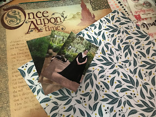
Hi there, here is my 5th and last Guest Design Team August 2023 layout for the  Lasting Memories Layout Blog

My daughter’s wedding was very different and therefore uniquely special. For this layout, I used 3 photos of her with the details of her dress and unusual guests highlighted.
First I had to choose the papers.


I had this sketch to work with.
After finding the right papers I then began laying out the layout.

Once happy with the main aspects of the design, I then added the photos.

Finally a blinged up the page with die cuts and stickles. I am very excited with how this turned out.
I love this photo spread and love how this all came together from the great sketch.
Thanks for looking. If you see anything that you like, don’t forget to follow and leave a comment.

Happy scrapping until next time.

💛Kathy

Everyday Moments August Design Team Layout

 Everyday Moments

Hi there, Kathy here with my August layout from @Scrapasketch.com.

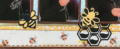
Using Sketch Sketch # 86, I had fun creating a layout of my daughter and husband tasting honey from honeycomb for the very first time.

I stuck pretty close to the layout structure but added a few of my own touches to create dimension and individuality.

First of course - the papers. Now these change a bit throughout the process as I realise I need something different.


Next I cut the fish tails so that I can place out the journal line which I hand sewed to add dimension and trace the track of the bee. The fishtails I used a printable from Scrap a Sketch from the Summer collection. Perfect for this project.


Then I mounted my photos and started to layer up the elements of the layout. It really was quite an easy layout to work with.


I used Tim Holtz Gathered Twigs to distress the edges and this added depth.


And finally I hand journaled along the sewn bee line.

Thanks for taking the time to look. If you purchase anything from www.scrapasketch.com - printables or stencils - add my code KATHYLOVES2SCRAP10 - to receive a 10% discount.

If anything appeals to you leave a comment below and I’ll get back to you.
Happy crafting
💛Kathy


Books and Cleverness A layout using Magical Memories designed by Alicia Redshaw. Hi there it is Kathy from Kathyloves2scrap with a layout ...